User engagement is at the core of the theory of design. Designers should also search for the latest strategies to improve user interaction with products, websites and services such as video games. To improve user engagement, your app should be more user friendly and fun to use.
The best example is that most of the popular online Rummy, Pool and Ludo games have improved their user interface.
There are 2 targets behind every Mobile App. One is to make the user download the app and the other is to make them use the downloaded apps. The first thing is hard, and the second one is even harder. So how do you get your users involved after your mobile app has been downloaded?
Research shows that almost 90% of mobile media time is spent on mobile apps compared to the mobile Internet.
However, you know that popular social media and video streaming apps will take the lead on mobile devices, with only a small number of active users leaving your app. Therefore I suggest six strategies that you should use to solve this issue and to get more user engagement.
Let's discuss the factors which boost user engagement.
1. Enhanced Onboarding experience:
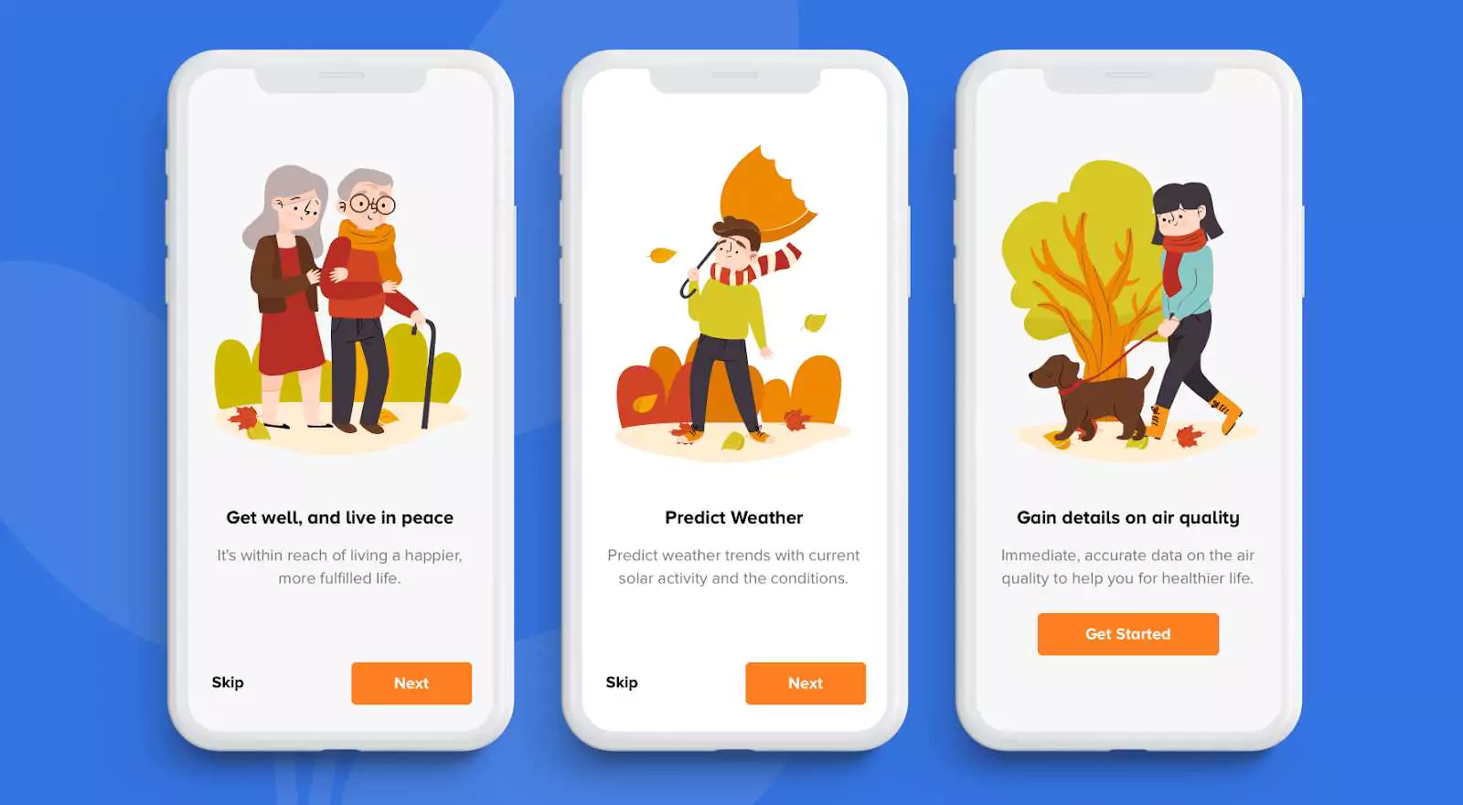
Your on-board experience is your first conversation with your users. A major error that device marketers create is leveraging the onboard interface to show the user how to use the device. Start focusing on presenting how beneficial the app is and how far that will work good for the customer. Display the importance of your app!
Recall the unwritten rule of the marketers - "More visual content, less text content".
2. Asking for Signup / Login:
If your app requires some sort of login or authentication, particularly through Facebook, suggest showing the potential consumer as much of your app as possible before you enable them to log in. People also get really stressed out when asked to authenticate through Social Platforms.
At least guarantee that consumers should be able to use the app sometime until they are requested to sign up.
3. Crash-free app:
There's no crash-free app or bug-free app. But there are also neatly-written application threads that guarantee nearly flawless app pace and user experience. Do you have the developers who will hit it? If not, maybe creating an app isn't for you.
Now, speak to the colleagues and make sure the pace is an important benefit for both of you. When you're providing a very quick and stable app, your user experience could be improved.
4.Push Notifications
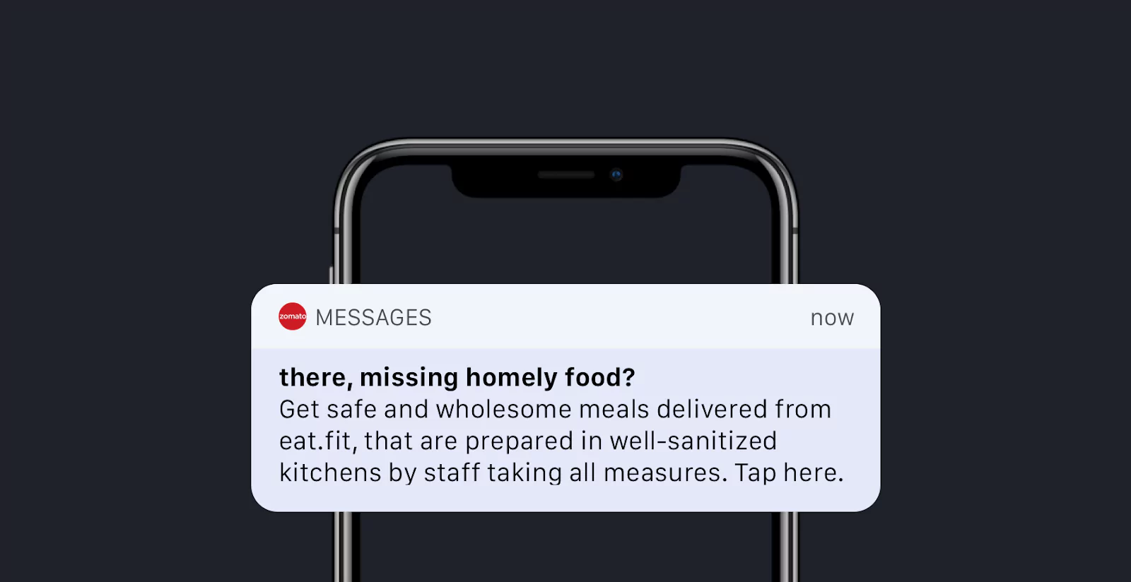
It should not be the case to go quiet for long periods of time. And if you adjust stuff inside the app to make something better and nicer, then at the same time you don't let customers learn about it, so what's the point of changing it all? On the other side, if you send push notifications too much, you could end up looking like a spammer for users.
Be useful, and don't be boring. Your push notifications may be personalized on the basis of target apps, channels, and even user accounts.
5. Contact you within 3 clicks
Many device developers are finding it very hard to reach them. My query is, why? Frankly, there's little reasoning to that, because an app developer wants input from the consumer. So a customer will only have input if they know just how to get in contact with you.
Therefore, let the users believe that you're really available for them. Provides quick links to assistance websites, FAQs, and support sites. When you've got their order, send an automatic response with some sweet text to let them know that you've gotten it and that you're reviewing it.
6. Gamification
In order to make app usage fun and enjoyable, gamification is the method of integrating game-like elements in the most boring products and services. Based on the activities completed, users are awarded points, badges, virtual money or ranks. Gamification means not just designing functional concepts but also involving and encouraging consumers to engage with products, programs, platforms, software, games and others.
I have listed out a few of the essential factors for Gamification design:
I. Creating User Interest with Goals
Set goals for users as they give the system a sense of purpose. Goals make them feel happy when they succeed and achieve them, goals empower them with a sense of joy, an essential component of fun.
II. Set Different Rules with Different Levels
Agree on the "playing" rules In reality, limitations enable us to become more creative and let us enjoy the fun. Laws are regular and continuous acts that consumers need to do and are closely aligned with the product 's main offering.
III. Providing progress feedback
Offer users feedback, especially feedback on development. Users need to see how well they are doing in the light of the goals you set for them and the guidelines they agreed on. It comes in different visual forms, such as progress lines, levels, messages of motivation, animations etc.
IV. Offer Rewards and Points
Even provide users rewards. These are items that we give them for the time and effort they put in and they can be anything from virtual awards, points, medals, coins, leaderboards, stickers, avatars to real rewards of resources like money.
V. Motivation
Give the users the motivation to act. There are 2 types: intrinsic motivation, which comes from within us like interest, pride or a sense of achievement and extrinsic motivation, which comes from outside of us like wealth, grades or praises.
Other Factors Include:
Freedom of choice
Any app or system will be fun when users choose to participate in it voluntarily and follow the goals and rules. Not when pushed or fooled into it.
Freedom to fail
Failing without consequences keeps users engaged than when they're getting punished because they can try again. Denying them that hinders their involvement.
Examples of Apps using Gamification for User Engagement
Forest app
Keep Focused, be here. Forest app is a sort of productivity app that lets you stay focused on life's important things.
You define a period in which you want to work done and during that time, a virtual tree will blossom. That will only happen if you don't use any other app on your phone during that time. To fail to do so means your tree is dying.
Set the time to 10 minutes by clicking on "Plant." Users love how the messages at the top of the screen continuously change as time progresses, from "Don't look at me! "To" Watch me not! "Hanging in there! "Nice messages help in keeping the users focused and avoid checking their phone. You can choose to "give up" at any stage, which presumably means that the tree you have been planting will be killed.
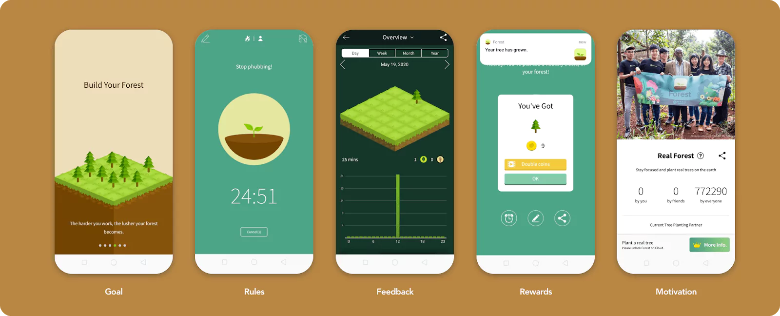
Goal
To make a virtual forest.
The game is to plant a virtual tree, which takes ten minutes to grow, for example, and as long as you can stay off your phone for long enough, the tree will grow and be added to your forest on-screen for today, but if you get back on your phone too soon, the tree will wither and die.
Rules
You should keep the app open.
If you exit the app or attempt to use any outside feature on your phone for more than a few seconds, your virtual tree will die out. While the death of a digital tree is obviously very low-stakes, and there are no real repercussions if you allow it to bite the dust, over the course of a week using the app I discovered that just knowing a few measly minutes away from your phone is all it takes to save a life - even that of a fake tree - is a remarkably effective motivational strategy.
Feedback
Tree count
It will provide you with the count of trees that you have grown. It will motivate users to plant more trees.
Rewards
Will give you the rewards via Coins
Forest app makes you pay attention to just how distracted you really are. Then, it tells you to get back to work.
Motivation
Collaborative feature
You can create a room and invite friends and family members to join you. If anyone of you exits the app when the timer is running, then the shared tree will automatically die - talk about not wanting to let the team down.
Gamification theory behind the success of GooglePay
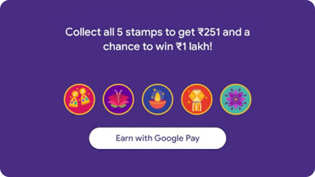
Google Pay came up with a gamification concept on Diwali 's occasion according to which users had to collect stamps by scanning festive objects or transferring more than Rs 33 money / making payments. Every payment a user has made is stamped with them. Multiple stamps of the same type could have been obtained by the user but they won Rs 251 only when they have 5 different stamps.
The Dopamine effect
Every gamification technique operates on an effect produced by the release of a chemical called dopamine into your brain. The dopamine release tells us that we've accomplished our goals. This keeps us going toward the goals; it's a chemical incentive. Essentially, this is a drug that makes you feel good and yes it's addictive.
Each time a user received a stamp on the Google Pay app, they were given a little boost in dopamine. This made them feel victorious. This sense of joy and satisfaction in expecting future rewards motivates us to do more. All the things they did, asking for stamps from mates, making payments, making smartphone recharges they should have done at a later date, are that they needed more dopamine, so they got it every date they got a new stamp and that kept them going.
Hook model
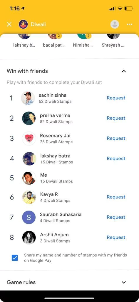
Google Pay started the game with a simple feature that allows a user to send their friends a request for stamps by sharing links or requesting it on the Google Pay app. After a few days, they expanded this function and introduced a leaderboard, where users could see all their friends in need of stamps and give them stamp requests with ease. Google Pay might have realized that in the application of giving and asking for stamps, the social quotient of this feature kept users hooked, and they might have chosen to build on it and make the whole process easier.
They had taken down a three-step procedure to just one button press. Now, instead of picking a stamp, every user only had to scroll to the leaderboard and press the "Demand" button on each of the mates. They made this entire method easy as they wanted users to ask for stickers more often and develop a habit around it. The problem for the user was not having enough stickers and it just became easier to ask for it now.
Google Pay required users to keep completing the tasks until they got the bonus money or they realized it's going to take a lot more time and energy than they had originally planned and decided to drop out.
Gamification system inside the Fitbit
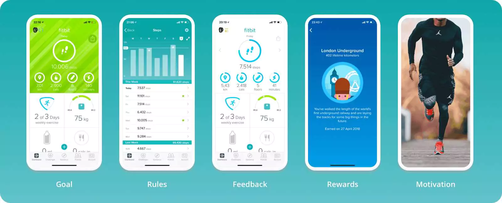
Goal
Reach 10,000 steps each day.
Each time users achieve their aim, Fitbit smartwatches and trackers become more important, increasing use and acceptance, so target completion rate is directly correlated with the core product.
Rule
Walk!
The fact that walking is a simple task, and trackers automatically record steps, means that there is no need for users to decide on different inputs, and there is no change when it comes to participation.
Feedback
Progress circle and step count.
This comes in the form of a circle of progress and a countermeasure, letting people know how much longer they have before they meet their target.
Rewards
Badges and trophies.
For special accomplishments, Fitbit offers badges and medals and uses measures as currency to create leaderboards and rank users.
Motivation
Motivating about Physical health.
Apart from rewards, users are intrinsically motivated to become physically healthier, which is quite a nice end goal.
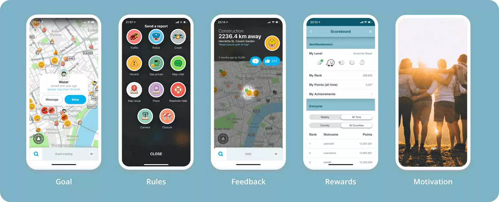
Gamification system inside the Waze
Goal
Giving and receiving help from other wazers
You get to become a Waze group member, providing support from other wazers and getting it. The more participants, the greater the increase in content created by users and, eventually, the more advertisers they draw on the site.
Rule
Waze asks its users to report incidents.
To do so, they will select between 11 types of reports (plus sub-reports), send them on-the-spot and do it while driving, which is quite a number. Because of the rule's complexity, the percentage of participants probably isn't overwhelming either.
Progress
Users get likes and comments for their reports
Translate into points later that will allow users to increase their level. It's a very cool engaging way to get feedback on their acts.
Rewards
Points
Waze rewards users with points which enable them to progress through 5 levels. It also provides accomplishments and the platform shows them their overall rating.
Motivation
The feeling you get after helping other people.
Users often feel welcomed, essential and useful as part of a group - a powerful motivator for becoming a participant.
Gamification system inside the Duolingo
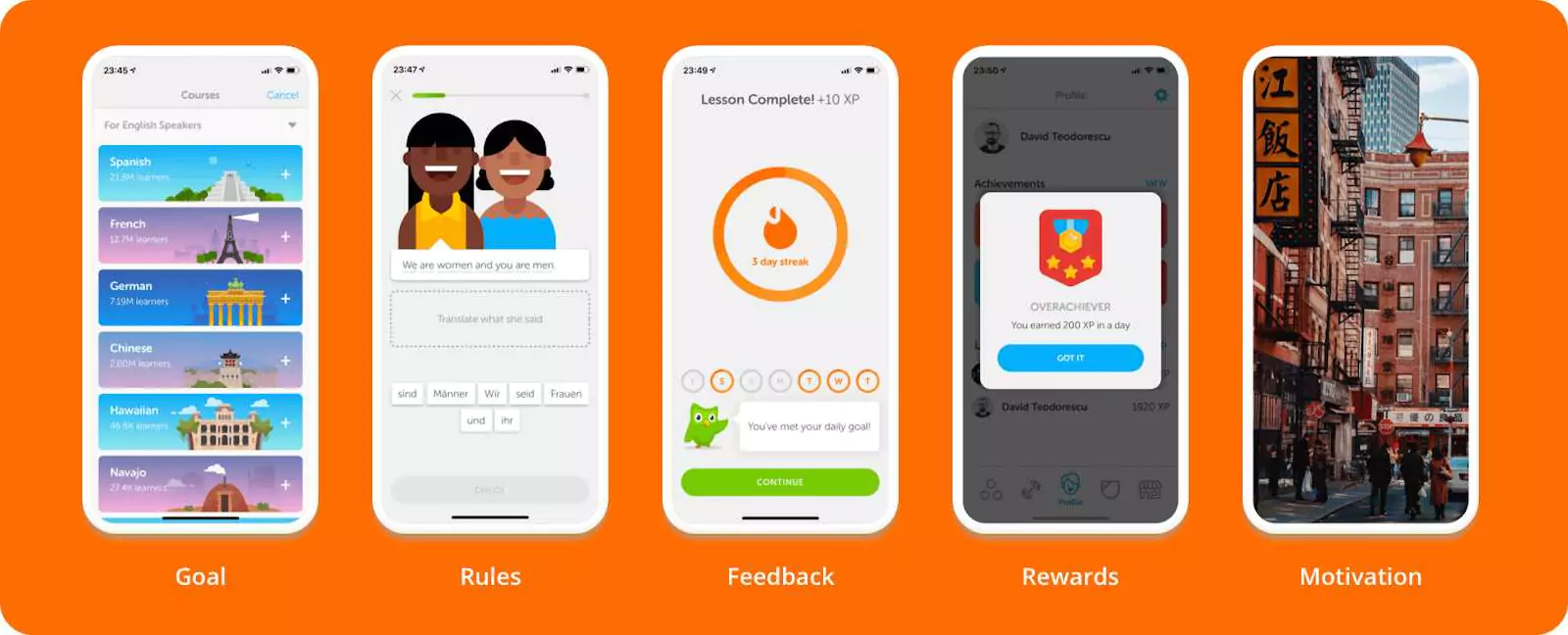
Goal
Learn a new language.
It is important because from a professional and personal point of view, it can benefit people, but it's also very demanding. And Duolingo knows that and by making learning enjoyable and interactive, he seeks to draw interested people.
Rules
Take lessons and practice
It is easy and there is no time limit. This is an important rule and the main obstacle is potentially keeping people interested in doing so for a longer period of time.
Feedback
Progress bars and progress circles, weekly breakdowns or chapter levels.
Users see how well they perform by following a number of visual elements such as progress bars and progress circles, weekly breakdowns or chapter rates.
Rewards
Highlights streaks and gives badges
Duolingo highlights streaks and gives badges for special accomplishments but also provides a few smaller prizes such as crowns, notes of motivation or quizzes about success. Within the platform, every action is seen as an opportunity to add interactivity to the system.
Motivation
Users improve their careers
Learning a foreign language helps consumers develop their jobs, make new friends and experience different cultures, all of them intrinsically important incentives regardless of the product's particular intent.
To employ gamification within the development of the website, contact Appiness Interactive, the provider of the Best User Experience Design in Bangalore.


