There is no denying that the first thing we see when we wake up and the last thing we look at before sleeping are our smartphones. You probably must be reading this article from your smartphone too. It is a reality we cannot escape that life without our pocket-sized friends is almost impossible (yes, off-the-grid people also do exist).

This is why leading UI/UX designers today emphasise implementing a “mobile-first” strategy in designing products and services. In this article, we shall dive deep into understanding the game-changer of a design and its implementation.
What Exactly Is Mobile-First Design?
Just like the name, the strategy is also simple. Mobile-first designing is a notion that backs brands to prioritise designing the product website for a smartphone before anything else. A well executed mobile-first designing strategy can exponentially increase your product’s sales and website traffic.
From Pockets to Hearts: Looking At The Mobile Boom

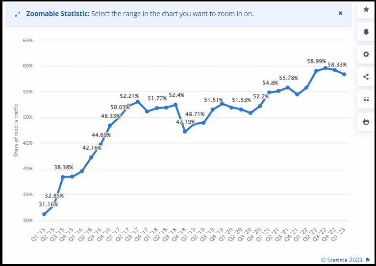
The recent report made by Statista shows how the domain of the internet has been overpowered by the sheer presence of mobile phones with a commanding 54%.
Imagine entering an electronics appliances retail store. Look around and you’ll notice what is preferred by customers today. More often than not, people enter there to buy a smartphone than any other gadget.
By conceptualising the product design to fit the 6-inch screen, businesses are slowly attempting to become our mutual mate from the pockets. Adopting a mobile-first approach can aid businesses to streamline their products strategically and focus on building a solid foundation.
Why This Strategy? What are the Advantages of Mobile First Design?
To begin with, we have to understand the schema behind this strategy. We always imagine success in moving from something small to large, right? Businesses also are seen to start from a small scale later move into the global market. Think of your product design just like that.
Evaluating the limitations of a smaller screen, the company can build their product with a Responsive Web Design (RWD). In the end, the idea behind this is to make your product design as comfortable as possible for your customers. Using RWD, the customers no longer have to zoom in or pan out their screen as per its size.

Any SEO expert will tell you that the search engine does have a softer side for your mobile phone. Interactions mean everything to a business today. To envision better interactions in the digital domain, leading corporations have operated under an inductive approach to identify pain points and make quick decisions.
Adapting to lower-end browsers and optimising your design to produce maximum interactions can therefore be more effective than doing the opposite. As we pointed out earlier, obstacles outside the screen size such as bandwidth, and so on can make a difference in producing the ideal user experience.
Analysing the Best Practices for Mobile-First Design: How Do We Reach the Pockets then?
Well, to design any product effectively, one must build a strong set of data on which they can make sure-shot assumptions. Let’s imagine we are building an online platform for an automobile store. First, the designer must address the target audience of the website.
To do this, the designer must finally take that bold decision of answering the life-long debate of form vs content. Content matters and comes ahead of any form.
Leveraging smartly and concisely addressing the target audience comes before building any sort of form. Since we are forming content for a small screen, it is necessary to prioritise and hierarchise the content we intend to show. This also mean taking away a lot of filler content with a strong heart.
Size does matter. Designers must never forget the constraint of space that can come along with our pocket-sized friends. Always make sure to go as far as possible from pop-up ads for your website.
Now that the content is sorted, optimisation comes next. The mantra to the best design is interactions, interactions and interactions. Therefore, one must consider the maximum potential that the content can produce on a touch screen.
Another aspect of optimisation is enhancing the website’s speed. This can be done by uploading compressed images along with the reduction of HTTP requests. The final part of optimising your product to its best form is by enabling offline interactions. Facilitating offline usage accompanying caching content must be a part of your product design optimisation.
Additionally, make sure to keep on testing your product from time to time to avoid any sort of future complications.
Last but not least, the quality of any successful entity is to adjust to the changing demands of its surroundings. We can see how Virat Kohli is still the King of cricket; thanks to his constant changes in approaching the game. Similarly, making sure to be up to date with your design by observing your user behaviour will, thus, make you a major thought leader in the industry.


